01
Business cards
A confident introduction. Contrast and generous margins give the name presence before the conversation begins.
A precise, composed identity for a trading company.
Built to express trust, authority and lasting value.
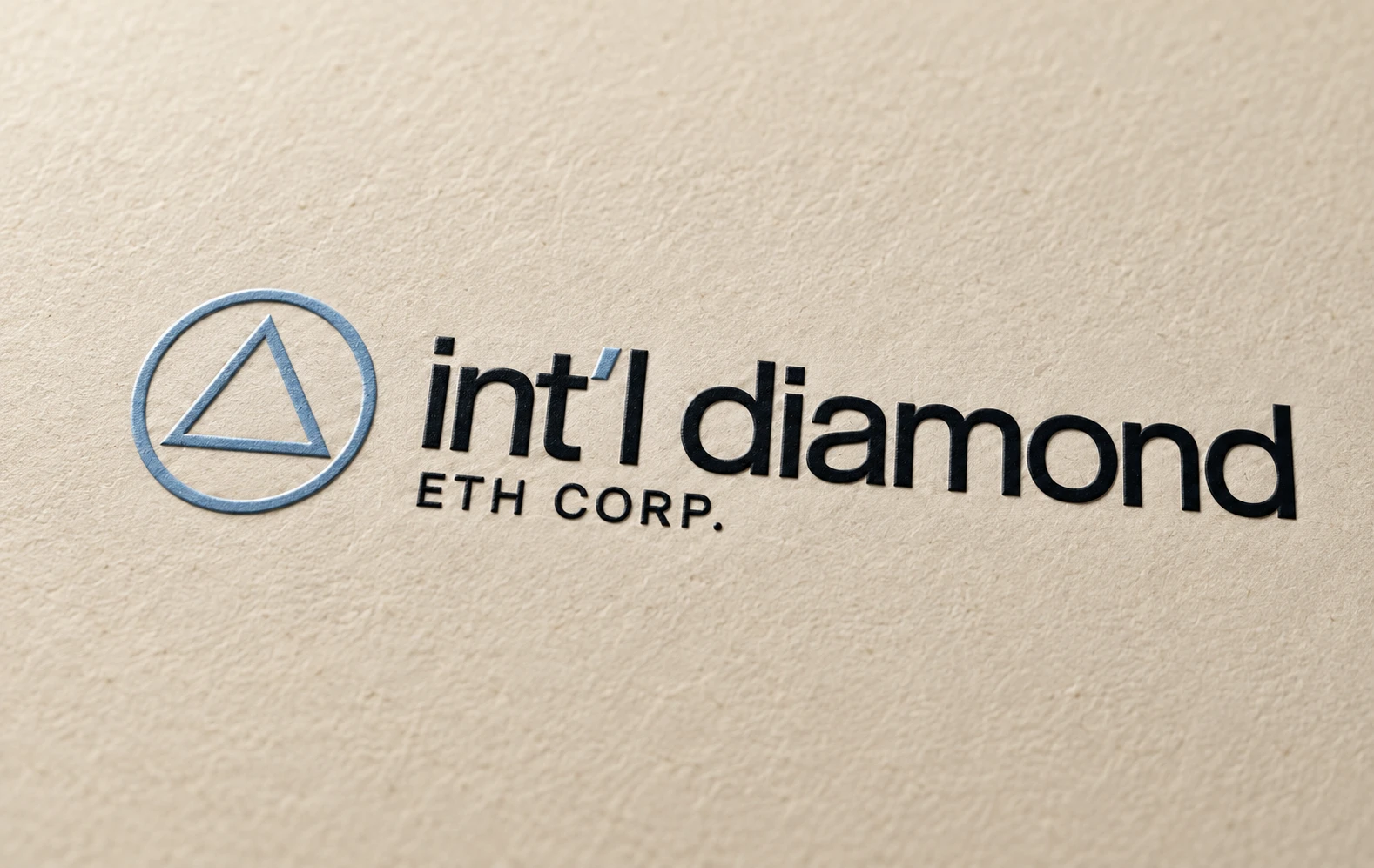 01 / Colour emboss on light khaki
The direction is calm, clear and deliberate. It presents INT’L DIAMOND as a company that approaches trade with focus and composure.
Readable typography, consistent spacing and clear hierarchy make the brand easy to understand. Repetition across every touchpoint builds familiarity.
Strong contrast and confident scale give the name presence. Simple geometry and disciplined layouts convey control and attention to detail.
Light khaki paper, colour embossing and a controlled palette suggest care and permanence. The expression of money is considered and understated.
The design establishes a professional first impression. Lasting trust is earned through the company’s conduct, transparency and delivery.
The colour treatment pairs an ice-blue symbol and apostrophe with an ink-black wordmark on light khaki. In the embossed application, registered colour sits on raised paper forms, adding a subtle sense of craft and value. The upright triangle introduces direction and focus. The surrounding circle provides balance and continuity. These are the intended visual associations of the mark. Together, they create a simple signature that remains recognisable across print, signage and apparel.
Ice blue creates a distinctive point of recognition. Ink black anchors the identity. Light khaki adds warmth and gives both colours room to work.
Ice blue is intended to feel calm and considered. Use it for accents, technical rules and selected materials.
Ink black gives the wordmark weight and creates a strong foundation for high-contrast applications.
Light khaki softens the palette and introduces a tactile, paper-like warmth. It gives the ink-black lettering a grounded setting and balances the cool blue accents.
abcdefghijklmnopqrstuvwxyz
ABCDEFGHIJKLMNOPQRSTUVWXYZ
0123456789 / + ( )
The wordmark takes its direction from tightly spaced, lowercase neo-grotesk lettering. Its plain forms feel direct and contemporary; the smaller uppercase ETH CORP. adds a formal corporate register.
The proposed type direction is Helvetica Neue or a close, properly licensed neo-grotesk. This page uses a system sans serif stack. Regular and medium weights preserve the quiet tone; careful hierarchy does the work.
A proposed company homepage brings the identity into a digital setting: confident typography, architectural imagery and a clear path to contact. The desktop and mobile treatments share the same visual discipline.
Website design concept for creative review. On-screen content and controls are illustrative.
From a first introduction to a physical presence, the same design principles carry through. Select any mockup for a closer look.
A confident introduction. Contrast and generous margins give the name presence before the conversation begins.
Clarity in every exchange. A restrained header and precise rules create an orderly framework for serious communication.
Value you can feel. Ice-blue stock and blind debossing explore a quiet, tactile application of the identity.
A disciplined point of view. Editorial hierarchy and technical grids express a considered, systematic approach.
Authority at scale. A single message, a clear silhouette and strong contrast keep the brand immediately recognisable.
A tangible presence. Architectural materials and dimensional lettering translate the identity into a professional setting.
Recognition without excess. The symbol stands on its own, with a discreet wordmark reinforcing the name.
One coherent identity. Modest placement and restrained colours make the brand wearable and consistent.
Precision on a smaller screen. Readable type, clear structure and open space carry the same visual discipline into digital.
Concept visualisations for creative review. Final artwork, type licensing, embroidery and print specifications will be resolved during production.